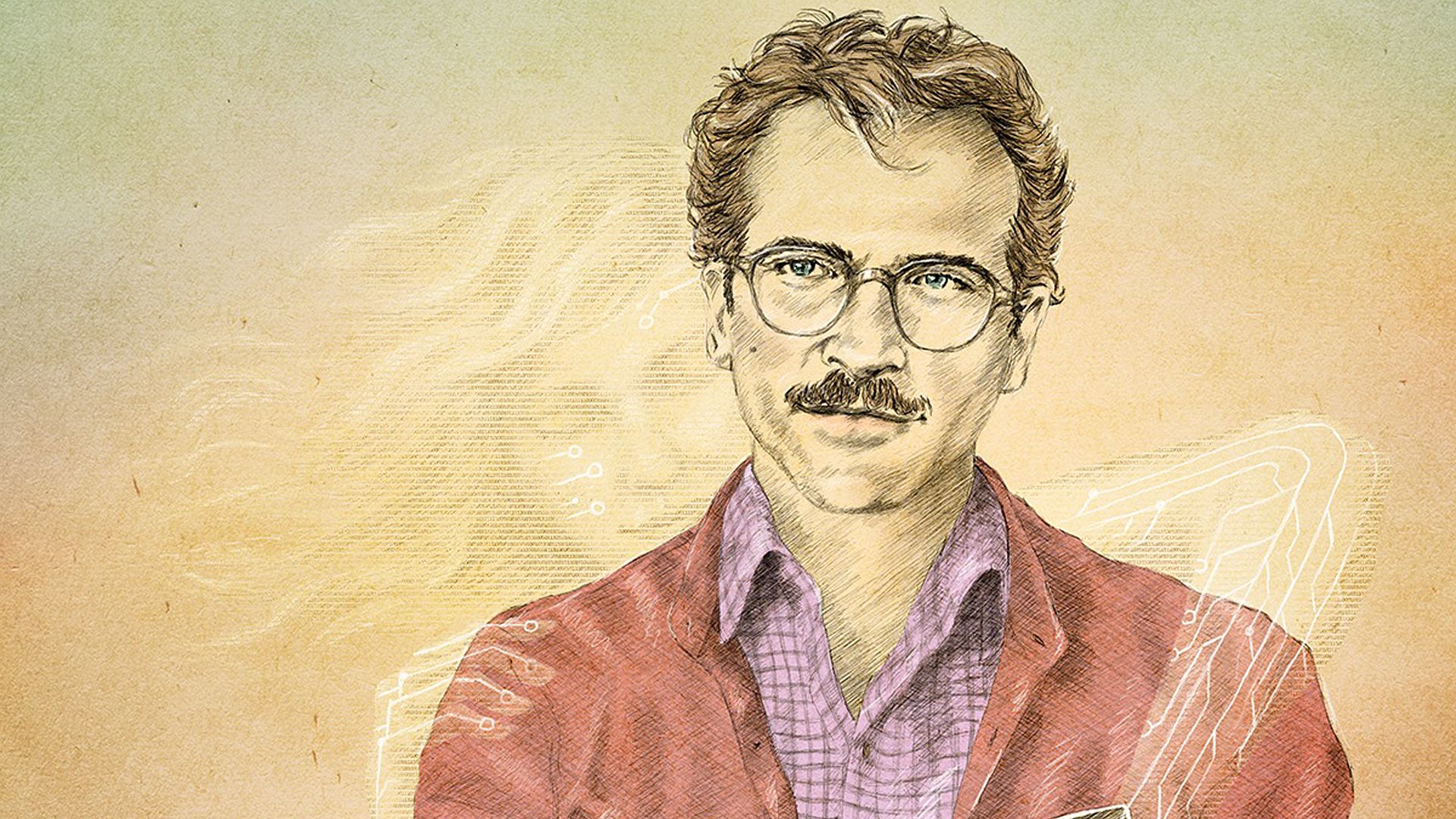
GIVE 'EM HELVETICA!
Description
<p>These films, many of them I haven't seen, use the typeface Helvetica on their (standard) posters. Designed in 1957 by Swiss designer Max Miedinger for the Haas Type Foundry, it's what graphic designers and typographers classify as a neo-grotesque sans serif (for designers, “grotesque” doesn’t mean what you and I think it means). </p><p>In the 1960s, Helvetica came to signify all things on the minimalist side of mid-century modern. Its no-frills asceticism and finely crafted proportions made it a choice to telegraph a steady temperament, no-nonsense composure, and geometrical order. A few years later when typefaces went all Art Nouveau, psychedelic, and floridly whimsical, Helvetica stayed a favorite when the unspoken ethos was this: we mean business, but don't let our austerity make you think we don't give a shit about aesthetics. </p><p>Helvetica is probably one of the most widely used fonts in the world, especially if we count reincarnations and knock-offs of it. An average designer now has access to a gajillion fonts; you can choose anything you want in your desktop graphics--homemade, guerilla, asinine, gothic, punk, whatever. With that in mind, what is Helvetica used for nowadays? Sampling these movie posters will tell you a few things. Many fine designers will intentionally go with Helvetica for their needs because of its generic, formal feel that conveys an unassuming simplicity. </p><p>Other uses for Helvetica may fall into two categories: (a) designers who are taking the path of least resistance because it's easy and nondescript, suitable for lots of things from legal drama to dystopian sci-fi to documentary, or (b) designers who use it <i>ironically</i> to say our film's posing as simple and nonchalant, but there's a lot to digest under the surface. Lots of indie films use it for reason (b). Helvetica looks really cool in a "non-design" design, often posters with minimal embellishments, and the words pop in a solemn placement in a box, a bar, or a monotonous block. </p><p>I include ONLY the ones Letterboxd treats as the official standard posters, not the more artistically diverse variations. What's standard can change, so a non-Helvetica alternate could replace my choices on the LB list at some point. Some posters may not strike you as Helvetica at first, and that's because there are many variations in the font family, including weights, heights, widths. Then some designers spruce up their wordmarks by custom-kerning (spacing) the letters, or stretching the words horizontally or vertically (too easy to do with illustration software). </p><p>Suggestions are welcome if you spot Helvetica on a standard movie poster. I may debate with you here and there, because other typefaces, like Univers, Akzidenz Grotesk, Haas Unica, Folio, or Arial, could be easily mis-identified as Helvetica. We'll have to look at the glyphs closely to pick up tell-tale features that distinguish them. If I made a wrong call, let me know.</p>
Number of Movies
43
Helvetica
You Can See Everything

Control

Trainspotting
T2 Trainspotting
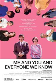
Me and You and Everyone We Know
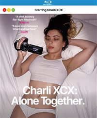
Charli XCX: Alone Together
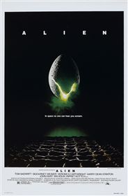
Alien
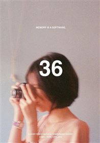
36
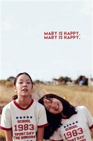
Mary Is Happy, Mary Is Happy
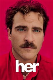
Her
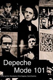
Depeche Mode: 101
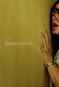
Backrooms
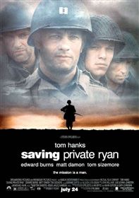
Saving Private Ryan
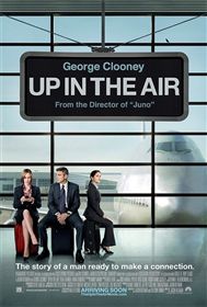
Up in the Air
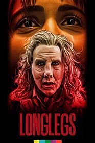
Longlegs
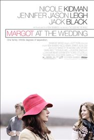
Margot at the Wedding
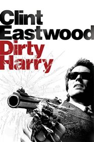
Dirty Harry
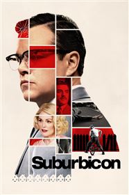
Suburbicon
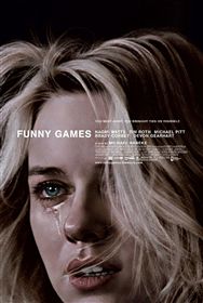
Funny Games
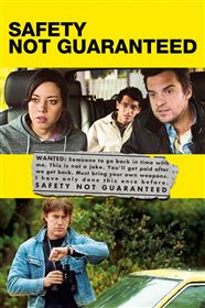
Safety Not Guaranteed
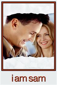
I Am Sam
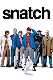
Snatch
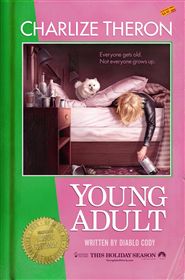
Young Adult
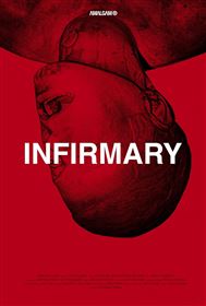
Infirmary
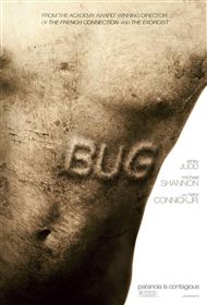
Bug
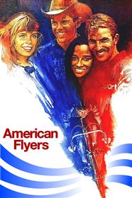
American Flyers
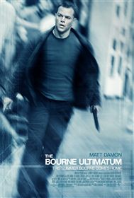
The Bourne Ultimatum
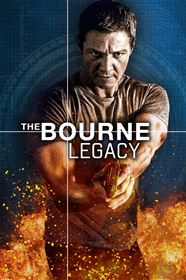
The Bourne Legacy
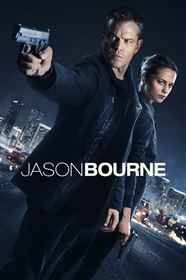
Jason Bourne
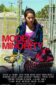
Model Minority
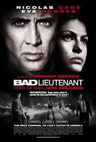
Bad Lieutenant: Port of Call New Orleans
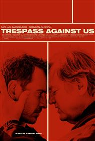
Trespass Against Us
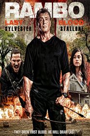
Rambo 5: Last Blood
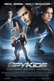
Spy Kids
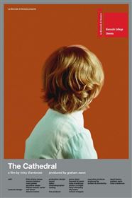
The Cathedral
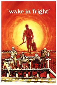
Wake in Fright
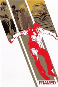
Framed
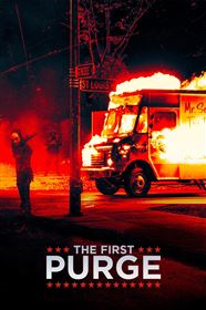
The First Purge
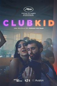
Club Kid
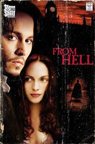
From Hell
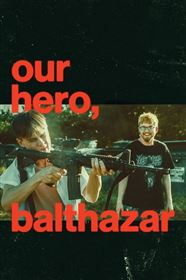
Our Hero, Balthazar
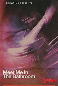
Meet Me in the Bathroom


